
이전의 내용과 이어지는 내용
이전 내용이 궁금하다면 클릭
한 건의 데이터를 샘플링했었는데 이를 80개의 파일에 똑같이 적용하여 통합해보고 주제에 맞게 데이터를 가공해보았다.
전체파일 통합하기
def union(i):
    file_path = f"./01_data/org/trfcard({i})/trfcard.csv"
    df_bus_card_org = pd.read_csv(file_path)
    file_path2 = f"./01_data/org/trfcard({i})/trfcard_columns.xlsx"
    df_bus_card_col_org = pd.read_excel(file_path2,header = 2 , usecols = "B:C")
    df_bus_card_col_new_dict = {}
    for i in range(13):
        df_bus_card_col_new_dict[df_bus_card_col_org.iloc[i,0]] = df_bus_card_col_org.iloc[i,1]
    df_bus_card_org.rename(columns = df_bus_card_col_new_dict,inplace = True)
    df_bus_card_kor = df_bus_card_org.copy()
    df_bus_card_kor = df_bus_card_kor.astype({"승차시각":"str","하차시각":"str"})
    df_bus_card = df_bus_card_kor[["승차시각","하차시각","승객연령","환승여부","추가운임여부","승차정류장","하차정류장"]].copy()
    df_bus_card["승차시각"] = pd.to_datetime(df_bus_card_kor.loc[:,"승차시각"])
    df_bus_card["하차시각"] = pd.to_datetime(df_bus_card_kor.loc[:,"하차시각"])
    df_bus_card["버스내체류시간(분)"] = round((df_bus_card2["하차시각"] - df_bus_card2["승차시각"]).dt.total_seconds() / 60,2)
    # 기준년도
    df_bus_card["기준년도"] = df_bus_card2["승차시각"].dt.year
    # 기준월
    df_bus_card["기준월"] = df_bus_card2["승차시각"].dt.month
    # 기준일
    df_bus_card["기준일"] = df_bus_card2["승차시각"].dt.day
    # 기준 시간
    df_bus_card["기준시간"] = df_bus_card2["승차시각"].dt.hour
    # 기준 시간(분)
    df_bus_card["기준시간(분)"] = df_bus_card2["승차시각"].dt.minute
    return df_bus_card
▶ 한 건의 파일을 샘플링했던 내역을 그대로 가져와서 union 함수를 만들었다. return 값으로 샘플링된 데이터가 나오도록 하였다.
df_bus_card_tot = union(0)
for i in range(1,80):
df_bus_card_tot = pd.concat([df_bus_card_tot,union(i)],axis = 0,ignore_index = True)
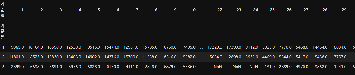
df_bus_card_tot
▶ 통합 데이터 프레임을 df_bus_card_tot 라 두고 이에 0번째 파일을 넣은 뒤 1부터 79번까지 for문이 반복되도록 하며
pd.concat을 통해 행단위로 df_bus_card_tot과 i번째 파일의 데이터가 통합되도록 하였다.

...

총 842608 개의 행으로 이루어진 하나의 통합데이터프레임이 생성된 것을 확인 할 수 있다.
from datetime import datetime

## 통합 시작시간
start_date = datetime.today().strftime('%Y-%m-%d %H:%M:%S')

df_bus_card_tot = union(0)
for i in range(1,80):
    df_bus_card_tot = pd.concat([df_bus_card_tot,union(i)],axis = 0,ignore_index = True)

## 통합 종료시간
end_date = datetime.today().strftime('%Y-%m-%d %H:%M:%S')
print(f"전체 실행시간 ==> {start_date} - {end_date}")
df_bus_card_tot
▶ 통합에 걸리는 시간을 확인해보고자 한다면 datetime 을 import한 뒤 위와 같이 작성하면된다.

근데 오류를 발견했다!!!
원래 기준년도 부터 기준시간(분)의 데이터 타입은 int 인데 float로 바뀌어져 있어서 소수점 첫째자리까지 나오는 것이었다!!!ㅜ
그래서 형 변환을 시키려고 해봤다.
df_bus_card_tot = df_bus_card_tot.astype({"기준년도":"int","기준월":"int","기준일":"int","기준시간":"int","기준시간(분)":"int"})
근데 오류가 났다...
Cannot convert non-finite values (NA or inf) to integer: Error while type casting for column '기준년도'
그래서 강사님이 풀어주신 방식으로 다시 통합하니 데이터 타입이 변하지 않고 int로 되어있었다.
### 최종 통합 데이터프레임 이름 : df_bus_card_tot
df_bus_card_tot = pd.DataFrame()
# df_bus_card_tot

### 0~79까지 폴더에 접근하기 위한 반복 수행
for i in range(0, 80, 1) : # 처음값, 끝값에서 -1한 값, 1씩 증가
    file_path = f"./01_data/org/trfcard({i})/trfcard.csv"
    df_bus_card_org = pd.read_csv(file_path)
    # print(i, "/", len(df_bus_card_org)) # for문 안에서 확인해주기 print!!

    file_path = f"./01_data/org/trfcard({i})/trfcard_columns.xlsx"
    df_bus_card_col_org = pd.read_excel(file_path, header=2, usecols="B:C")
    # print(i, "/", len(df_bus_card_col_org))

    df_bus_card_col_new_dict= {}
    for k, v in zip(df_bus_card_col_org.iloc[:,0], df_bus_card_col_org.iloc[:,1]) :
        # print(k, v)
        df_bus_card_col_new_dict[k]= v

    df_bus_card_org.rename(columns=df_bus_card_col_new_dict, inplace=True)

    df_bus_card_kor = df_bus_card_org.copy()

    df_bus_card_kor = df_bus_card_kor.astype({"승차시각" : "str",
                                              "하차시각" : "str"})

    df_bus_card = df_bus_card_kor[["승차시각","하차시각","승객연령","환승여부",
                                   "추가운임여부", "승차정류장", "하차정류장" ]].copy()

    df_bus_card["승차시각"] = pd.to_datetime(df_bus_card_kor.loc[:, "승차시각"])
    df_bus_card["하차시각"] = pd.to_datetime(df_bus_card_kor.loc[:, "하차시각"])

    df_bus_card["버스내체류시간(분)"] = round((df_bus_card["하차시각"] - \
                                       df_bus_card["승차시각"]).dt.total_seconds()/60, 2)

    df_bus_card["기준년도"] = df_bus_card["승차시각"].dt.year
    df_bus_card["기준월"] = df_bus_card["승차시각"].dt.month
    df_bus_card["기준일"] = df_bus_card["승차시각"].dt.day
    df_bus_card["기준시간"] = df_bus_card["승차시각"].dt.hour
    df_bus_card["기준시간(분)"] = df_bus_card["승차시각"].dt.minute

    df_bus_card_tot = pd.concat([df_bus_card_tot, df_bus_card], axis=0, ignore_index=True)
위가 강사님 풀이인데 내 코드랑 비교해서 왜 int로 잘만나오던것이 float로 형 변환되었는지 알려주시는 분은 소정의 상품을 드립니다.ㅎㅎ
데이터 시각화
우선 무엇이든 라이브러리와 파일 불러들이기 > 결측치 이상치 확인한 후에 진행하기~!
[데이터 시각화 라이브러리]
### 시각화 라이브러리
import matplotlib
import matplotlib.pyplot as plt
import seaborn as sns
# 폰트 환경 설정 라이브러리
from matplotlib import font_manager, rc
plt.rc("font", family = "Malgun Gothic")
# 그래프 내에 마이너스(-) 표시 기호 적용하기
plt.rcParams["axes.unicode_minus"] = False
▶ seaborn : 데이터 셋도 제공 , 파스텔 계열의 색감
matplotlib : 둔탁한 색감
그래프 내에 한글이 포함된 경우 폰트 처리가 필요함 (한글 깨짐 방지)
마이너스 표시 기호 적용하기
기준월 및 기준 일자 별 버스 이용량 시각화 분석
사용할 컬럼 : 기준월 , 기준일 , 승객연령
- 사용할 집계함수 : count()
- 이용량 집계를 위한 함수 : pivot_table() > 히트맵 시각화시 데이터 생성
- 사용할 그래프 : 히트맵(Heatmap)
ⓛ 데이터 count 집계하기
# y축 : index / x축 : columns / 집계 : count(승객연령)
df_pivot = df_bus_card_tot.pivot_table(index = "기준월" ,
                            columns = "기준일",
                            values = "승객연령",
                           aggfunc = "count")
▶ NaN은 결측치이다. 따라서 결측치 처리가 필요하다.
결측치는 0으로 대신하거나 평균값으로 대신하여 처리할 수 있다.
삭제할 수도 있으나 이는 정말 많은 양의 데이터에서 아주 적은양의 결측치가 있을때 적용하거나 .. 근데 권장하지 않음
② 결측치 (NaN) 처리하기
지금의 경우에는 모든 결측치를 0으로 대체하였다.
df_pivot = df_pivot.fillna(0)
▶ fillna(값) : 결측치(NaN) 모두를 값으로 대체

③ 히트맵 시각화
# 그래프 전체 너비, 높이 설정
plt.figure(figsize = (20,10))
# 그래프 제목
plt.title("기준월 및 기준일자별 버스 이용량 분석")
# 히트맵 그리기 : 히트맵은 seaborn 라이브러리에 있다.
sns.heatmap(df_pivot, annot = True , fmt = ".0f", cmap = "rocket_r")
plt.show()
▶
plt.figure( figsize = (너비 , 높이)) : 그래프의 너비, 높이 설정
plt.title( 그래프 제목 ) : 제목 설정
sns.heatmap(데이터 , annot = , fmt = , cmap = )히트맵 그리기 (히트맵은 seaborn 라이브러리에 있다)
- annot : False는 집계값 숨기기, True는 집계값 보이기
- fmt : 소수점 자리수 정하기 '.0f' 는 0자리수까지 보이기
- cmap : 컬러맵
컬러맵 참고 : https://jrc-park.tistory.com/155
plt.show() : 그래프 출력
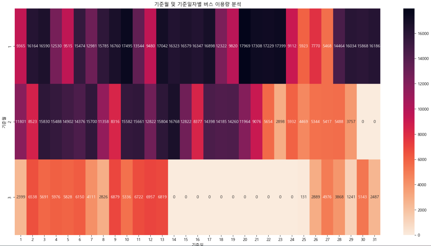
[해석]
- 1월 ~ 3월까지의 이용량을 분석한 결과 1월에 가장 많은 이용량을 나타내고 있으며
2월에서 3월로 가면서 이용량이 점진적으로 줄어들고 있는 것으로 확인됨
- 줄어드는 이유는 포항시의 특성상 외부에서 관광객의 유입에 따라 버스를 이용하는 사람들이 많을 것으로 예상됨
- 이에 따라 포항시 관광객에 대한 데이터를 수집하여 해당 년월에 대한 데이터를 비교 분석해볼 필요성이 있음
기준일 및 기준시간 별 버스 이용량 시각화 분석
df_pivot = df_bus_card_tot.pivot_table(index = "기준일" ,
                            columns = "기준시간",
                            values = "승객연령",
                           aggfunc = "count")
df_pivot = df_pivot.fillna(0)
plt.figure(figsize = (20,10))
plt.title("기준일 및 기준시간별 버스 이용량 분석")
sns.heatmap(df_pivot, annot = True , fmt = ".0f", cmap = "BuGn")
plt.show()
[해석]
- 버스 이용량에 대한 분석결과 일반적으로 출퇴근 시간에 많아야할 버스 이용량이 포항시의 경우 오후 시간대에 이용량이 밀집되어있음
- 특히 오후 1시 , 3시에 높은 이용량을 나타내고있음
- 이는 출퇴근 시간에 자가 차량을 이용하는 사람이 많을 수도 있다는 예상을 할 수 있으며 인구 분포가 노령인구가 많기에 오후에 이용자가 많을 수도 있음
- 따라서 포항시 인구현황 데이터, 경제활동인구 분석을 통해 비교 분석이 가능할 것으로 예상됨
- 또한 해당 이용량이 높은 시간대에 노선을 확인하여 특성 확인도 필요할 것으로 예상됨
기준시간 및 기준시간(분) 별 버스 이용량 시각화 분석
df_pivot = df_bus_card_tot.pivot_table(index = "기준시간" ,
                            columns = "기준시간(분)",
                            values = "승객연령",
                           aggfunc = "count")
df_pivot = df_pivot.fillna(0)
plt.figure(figsize = (20,10))
plt.title("기준시간 및 기준시간(분)별 버스 이용량 분석")
sns.heatmap(df_pivot, annot = True , fmt = ".0f", cmap = "OrRd")
plt.show()
[해석]
- 오후 3시 10분부터 20분까지의 버스 이용량이 많기 때문에 이 시간대에 하교하는 학생들이 많을거라 예상된다.
- 따라서 청소년과 어린이의 기준일 및 기준시간별 버스 이용량 분석이 필요하다.
- 출근시간대의 버스 이용량을 볼때 오전 7시 55분 ~ 8시 10분 사이에 이용량이 많은 것으로 보인다.
- 퇴근시간대의 버스 이용량은 오후 6시 ~ 6시 20분사이에 많다.
- 특히 오후 3시 20분까지 버스 이용량이 매우 크게 나타나고있다.
- 오후 시간대 이용자에 대한 추가 확인은 필요할 것으로 보인다.
기준일 및 기준시간 별 버스내체류시간(분) 시각화 분석
df_pivot = df_bus_card_tot.pivot_table(index = "기준일" ,
                            columns = "기준시간",
                            values = "버스내체류시간(분)",
                           aggfunc = "mean")
df_pivot = df_pivot.fillna(0)
plt.figure(figsize = (20,10))
plt.title("기준일 및 기준시간별 버스내체류시간 분석")
sns.heatmap(df_pivot, annot = True , fmt = ".3f", cmap = "PuBuGn")
plt.show()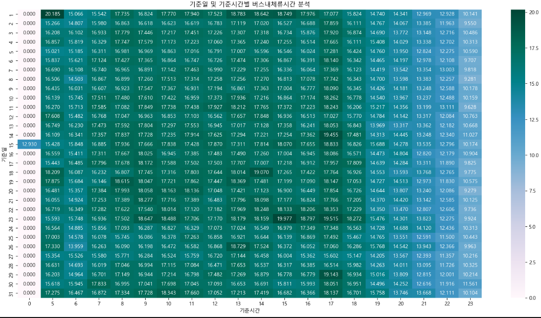
[해석]
- 긴 체류시간을 보이는 시간대는 오전 5시, 오후 1시~6시 사이이고 짧은 체류시간을 보이는 시간대는 오후 8시 ~ 11시 사이이다.
- 오후 8시 이전에는 주로 출근시간과 퇴근시간대에 긴 체류시간을 보이고 그 외의 시간에는 비슷한 양상을 보인다.
- 만약 급행 버스를 추가한다면 4시부터 6시 사이에 추가하는 것이 효율적일 것이라 예상된다.
---- 강사님 해석 ----
- 매월 1일에 장거리 이용자가 다수분포하고 있으며 오전 5시부터 8시를 전후로 장거리 이용자가 증가하고 있다.
- 오후 5시에 장거리 이용자가 매우 많게 나타남 -> 이는 포항시 주변 상권(경제활동인구)의 출퇴근 시간의 영향을 받을 수도 있다는 것으로 예상됨
- 7시 이후로는 장거리 이용자는 보편적으로 나타나고 있으며 위에서 분석한 기준일 및 시간별 이용량 분석에서 확인한 바와 같이 7시 이후의 버스 이용량도 급격하게 줄어드는 것으로 보아 저녁시간 버스 이용이 현저히 낮은것으로 여겨짐
- 장거리 이용자가 많은 시간대에 급행버스의 도입에 대한 추가 확인은 필요할 것으로 여겨짐
시간대 및 승객연령별 버스내체류시간(분) 시각화 (막대그래프)
① 필요한 데이터 추출하기
df_temp = pd.DataFrame()
df_temp["기준시간"] = df_bus_card_tot["기준시간"]
df_temp["승객구분"] = df_bus_card_tot["승객연령"]
df_temp["버스내체류시간"] = df_bus_card_tot["버스내체류시간(분)"]
df_temp
② 승객 연령별 빈도 확인하기
df_temp["승객구분"].value_counts()
승객구분
일반 772599
청소년 59037
어린이 10047
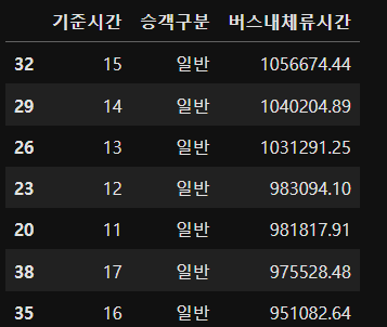
③ 그룹화 하기
df_temp2 = df_temp.groupby(["기준시간","승객구분"],as_index = False).sum()
df_temp2 = df_temp2.sort_values(by = ["버스내체류시간"],ascending=False)▶ 그룹화 한 후 head실할때는 행단위로 1개씩이 아니라 그룹단위로 1개가 조회됨. head(1) = > 각 그룹의 첫번째
기준시간과 승객구분을 기준으로 그룹화하여 버스내체류시간의 합계를 df_temp2에 가져옴
sort_values : 값을 기준으로 정렬
ascending = True : 오름차순 ( 내림차순 : False )
++ 데이터의 행과 열을 교환하기(행 열 바꾸기)
df_temp2.transpose()
④ 그래프 시각화 하기
fig = plt.figure(figsize=(25,10))
plt.title("시간 및 승객구분별 버스내 체류시간(분단위) 분석")
sns.barplot(x = "기준시간" , y = "버스내체류시간" , hue = "승객구분" , data = df_temp2 )
plt.show()
▶ sns.barplot(x = "" , y = "" , hue = "" , data = ) : 막대그래프 시각화
- x축 , y축 , 실제 데이터 , 데이터 프레임
- hue : x축 및 y축을 기준으로 비교할 대상 컬럼 지정(범주형 데이터를 보통 지정)
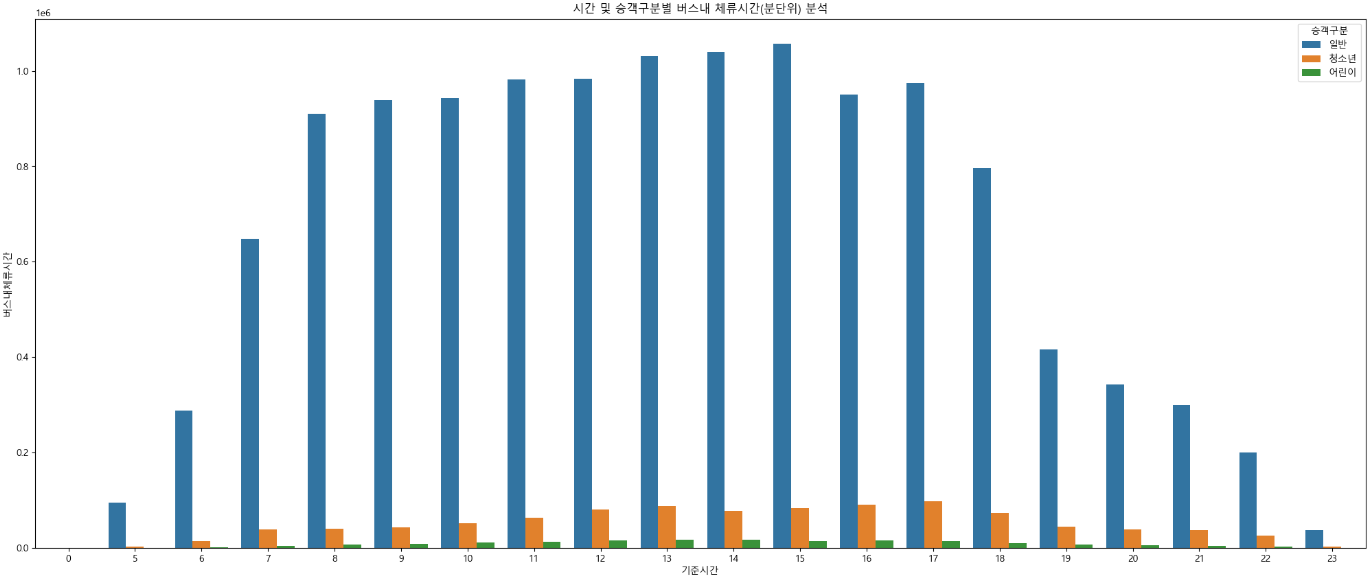
▶ 왼쪽 상단에 단위 1e6은 지수
⑤ histplot 시각화 : 두개 그래프 조합 (밀도 그래프)
plt.figure(figsize=(12,4))
plt.title("시간 및 승객구분별 버스내 체류시간(분단위) 분석")
sns.histplot( data = df_temp2 , x = "기준시간" , bins = 30 ,
             kde = True , hue = "승객구분" , multiple = "stack" ,
             stat = "density" , shrink = 0.6)
plt.show()
▶ sns.histplot( data = , x = , bins = , kde = , hue = , multiple = , stat = , shrink = )
bins : 사용할 막대의 최대 개수
- kde = True : 막대그래프에 밀도 선 그리기
- hue : 범주 데이터
- multiple = "stack" : 여러 범주를 하나의 막대에 표현하기
- stat = "density" : 비율로 표시
- shrink : 막대 너비 ( 0.6은 너비 100% 중에 60%)
승하차정류장별 버스내체류시간(분) 상위 30건 시각화 분석
df_temp3 = pd.DataFrame()
df_temp3["구간"] = df_bus_card_tot["승차정류장"] + '-' + df_bus_card_tot["하차정류장"]
df_temp3["버스내체류시간"] = df_bus_card_tot["버스내체류시간(분)"]
▶ 문자열처럼 + 기호를 통해 승차정류장 - 하차정류장 의 데이터를 갖는 구간 컬럼을 생성하였다.
df_temp3 = df_temp3.groupby(["구간"], as_index = False).sum()
df_temp3 = df_temp3.sort_values(by = ["버스내체류시간"],ascending = False)
df_temp3 = df_temp3.head(30)
▶ 구간을 기준으로 그룹화하고 버스내체류시간 컬럼의 합계를 내림차순으로 정렬한 뒤에
head를 통해 상위 30개의 데이터만 df_temp3의 데이터프레임에 넣었다.
막대 그래프
plt.figure(figsize=(20,20))
plt.title("승하차정류장별 버스내체류시간(분) 상위 30건 시각화 분석")
sns.barplot( x = "버스내체류시간" ,y = "구간", data = df_temp3)
plt.show()
선 그래프
plt.figure(figsize=(20,20))
plt.title("승하차정류장별 버스내체류시간(분) 상위 30건 시각화 분석")
sns.lineplot( x = "버스내체류시간" ,y = "구간", data = df_temp3)
plt.show()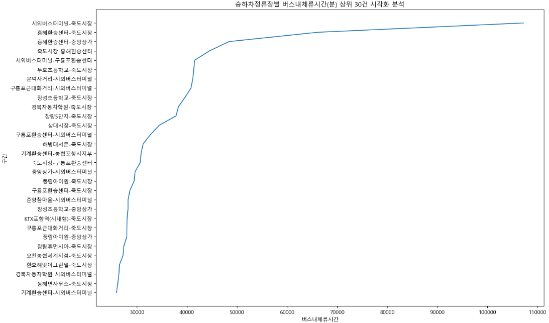
▶
plt.plot(df_temp3["구간"],df_temp3["버스내체류시간"]) 을 통해 선그래프를 출력할 수 있다.
plt.xlabel("구간") plt.ylabel("버스내체류시간(분)") : x축과 y축의 이름 넣기
plt.xticks(rotation=90) : x축의 값들 90도 이동
plt.grid(True) : 격자선 표시하기
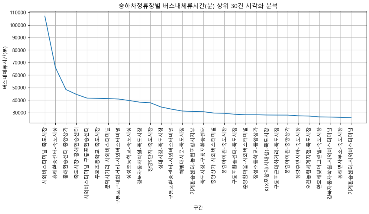
[해석]
- 죽도시장에서 하차하는 승객이 많음
- 시외버스터미널, 흥해환승센터 등에서 죽도시장을 가는 체류시간이 길기 때문에 이를 해결하기 위한 급행버스가 필요할 것으로 예상됨
'DB' 카테고리의 다른 글
| [데이터 시각화] - 원형그래프 / 워드클라우드 (5) | 2023.12.05 |
|---|---|
| [웹크롤링] - 다음 영화 사이트 웹크롤링 (8) | 2023.12.04 |
| MVC 는 무엇인가? ORM은 무엇인가? (2) | 2023.11.29 |
| [데이터실습] (1) - 한 건의 데이터 샘플링 (0) | 2023.11.29 |
| 데이터 전처리 - non mapping 방식으로 데이터 조회/입력/수정/삭제 (0) | 2023.11.29 |